We did a brainstorm session for Joanna from PoppetMade
Cat: What are you looking for from this half-hour online brainstorm session, Joanna?
Joanna: What I'm interested in:
1. How to make my stall more “professional” – considering all my items are handmade, how can I improve on my image? 2. What do you see working/not working as it is set up now? 3. Height – this is something that I have struggled with as my products are mainly flat! I've introduced the bib hangers to help with this.
I have two layouts:
1. Single trestle table 2. Double trestle table. This is when I share with a friend, but my portion is the same layout as a single. Her items are more bulky than mine (quilts, bags etc) so we can hang things up etc. This is usually a gazebo setup. Thumbnail test - the 'dress' principle
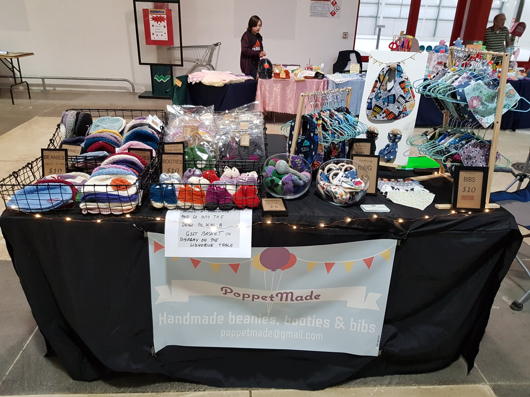
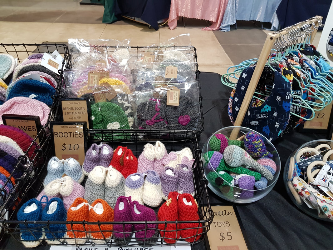
Cat: To start me off, I performed my 'thumbnail test'. I looked at a thumbnail-sized picture of the display and noted my impressions.
The stock itself is neatly displayed and well made, but the overall effect is that the stall looks a little jumbled, and part of that is because there's no unifying feeling for the stall display colours underneath the stock. I started by pulling out the main colour impressions of the display - and it was quickly evident that there were too many things going on. 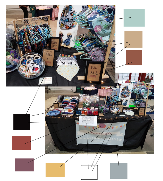
Colour consistency and a point of difference - the 'flavour' principle
I grabbed a couple of the colours that I had identified, and made a collage board of things she could use instead.
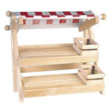
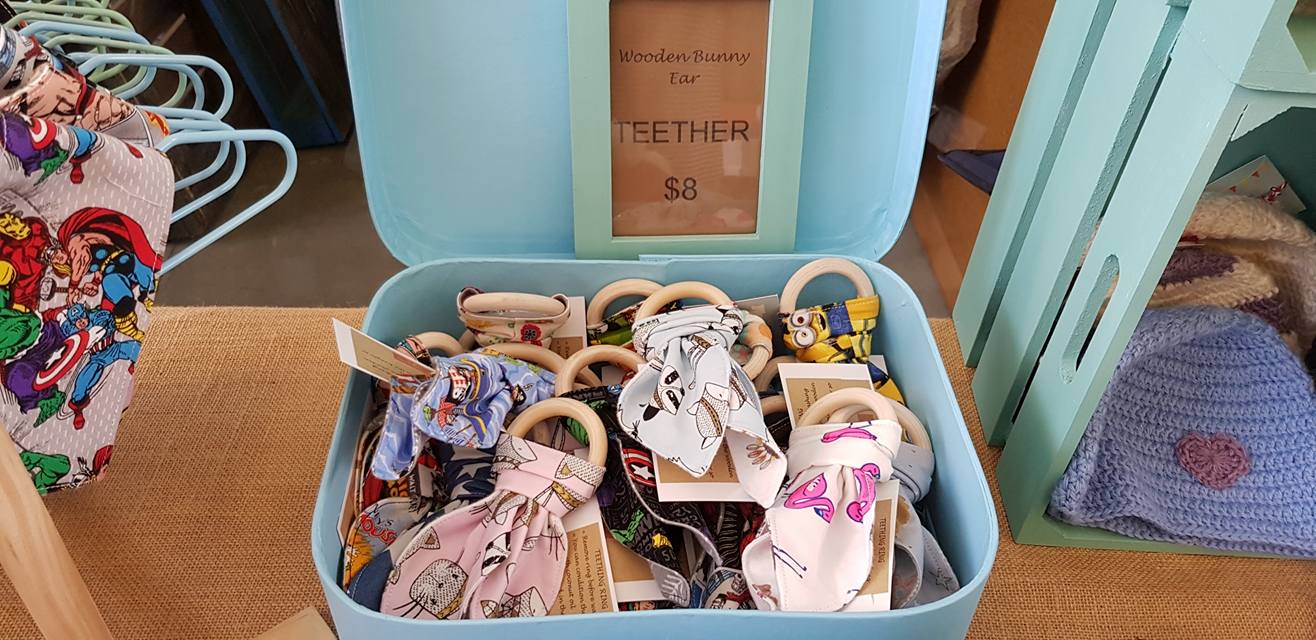
Black is almost always the right choice for a good tablecloth colour, but in this case, it was too stark - it didn't look like a stall featuring baby wear. The hangers and the blonde wood were my favourite elements of the original display, so I used the bib hangers as a starting point for a quick example colour scheme, and then I included her existing neutral wood and brown paper elements to give her stock a backdrop against which to pop. I suggested replacing the generic black baskets with vintage suitcases, painted crates (using her own colour choices), and repurposing old, mis-matched picture frames from op-shops for her price signage. 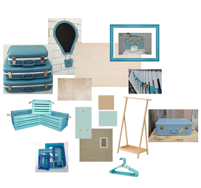
Visual interest - the 'dynamic layers' principle
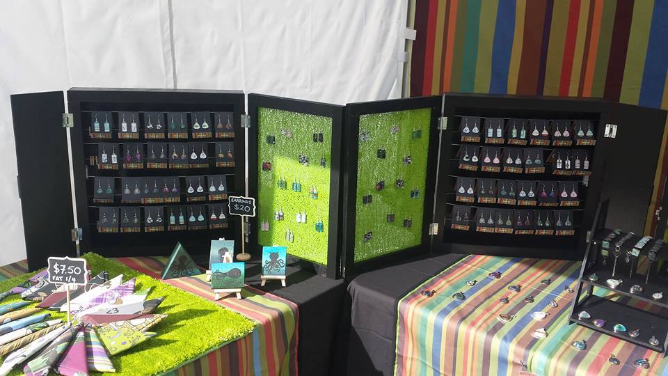
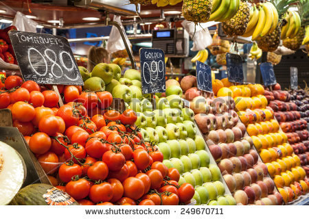
Once we had established a potential colourway to get the stall 'dressed for success', I then started to look at the next issue - the lack of dynamic height in the display. I talked about using fruit stalls as inspiration - stacking and tilting the crates to get the maximum use out of their depth, as well as having an easy, modular set-up for different display requirements at different locations. I Googled some image examples to illustrate my point.
Merchandising the stock - the 'fresh' principle
Following on from the fruit stall example above, I suggested that part of the 'jumbled' look could be due to the way that the stock was set out.
When you have all kinds of colours, there are two things you can do to freshen up the look of the stall:
If it suits the product, limit yourself to a specific palette - a range of 3 or 4 specific colours, from which you do not deviate. Alternatively, if you're like me, and your product requires a lot of shades of colour, sort your stock like a rainbow.
A signature style to get customers' attention - the 'hook' principle
Now that the hard part is done - the stall is dressed to kill, the stock is looking fresh and appealing, the dynamic layers make the best of the available space, the display itself fits the stall's flavour - how do you reel the customers in?
It's both simple and complex, and depends entirely on the individual circumstances. Each maker will have a different style, and therefore, a different hook. At Copper Catkin, we have several quiet signature items that are part of our display, and make us recognisable long before people get close enough to see individual stock items - we use the 'grass' rug, a variety of natural wooden pegs, our Miss Match stripe, and, of course, our favourite vibrant green.
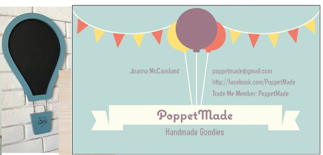
For PoppetMade, I suggested the use of a signature colourway plus possibly a signature shape -for example, a balloon-shaped chalkboard to match the balloons in the existing logo.
That kind of simple touch is what sets you apart from all the other stalls that look like chain-store window displays as a result of using unaltered chain-store items in their display. This works for the occasional stall, but for the vast majority, it just makes them and their products fade into the general 'market' impression - and that's absolutely not what you want!
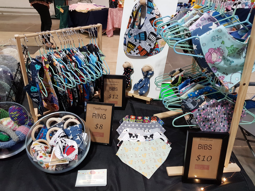
What Joanna Did Next
Now, here's the fun part - it's all well and good brainstorming ideas and throwing pictures around, but it's all hot air unless you take those ideas and run with them - and Joanna did just that!
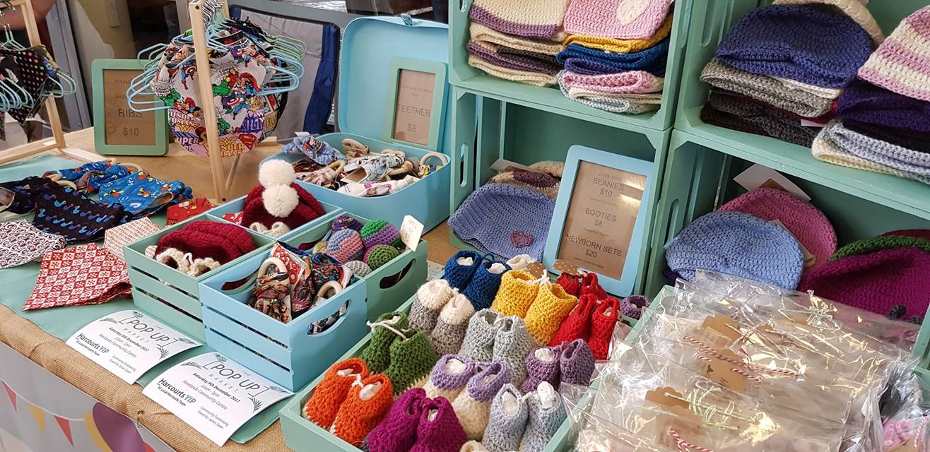
This is the most successful transformation that I have seen yet (images supplied).
I think we can all agree that this is an incredible makeover - and in only a week or so!
0 Comments
Leave a Reply. |
AuthorCat Drayer Archives
December 2019
Categories
All
|


 RSS Feed
